Subscribe to our
weekly update
Sign up to receive our latest news via a mobile-friendly weekly email
In the race to win trust and retain customers, milliseconds matter more than ever. In today’s SaaS-first world, a slow or unreliable experience doesn’t just frustrate users—it disrupts productivity and can drive entire teams to switch platforms. Whether someone is collaborating on a project, analyzing data, or communicating with their team, they expect speed, reliability, and stability—everywhere, every time.
That’s why Catchpoint has benchmarked the performance of leading SaaS platform websites to understand how they’re delivering on this digital promise. This isn’t about naming and shaming. It’s about spotlighting the real experiences users face, surfacing opportunities to improve, and starting a deeper conversation about what best-in class SaaS looks like in 2025.
Whether you’re a global SaaS giant or a fast-growing disruptor, one thing is clear: in the modern SaaS economy, a fast, resilient, and globally consistent digital experience isn’t just a differentiator—it’s the foundation of customer trust, adoption, and growth.
Tableau loaded a full page in just 1.1 seconds; Trello delivered key content in 0.8 seconds and maintained perfect availability.

Just 32% of companies—including Tableau, Trello, and Microsoft 365 —loaded key content in under 3 seconds. ClickUp took 8.4 seconds; Monday.com, 4.5 seconds.

Just 42% (8 of 19) met the 5-second Total Page Load target. The slowest (ClickUp) took 9.6 seconds on average.

Monday.com’s layout never shifts (CLS: 0.00019), but slow server response (1,755 ms) and main content load (3.8 s) drag down performance.

Strong across the board with fast document load (2.2 s), quick DNS (41 ms), and 96.7% uptime—despite its size.

Trello, Tableau, and Oracle shine in North America and Europe, but nearly all platforms—including leaders—deliver their slowest experiences in Middle East & Africa.

No company hit all 8 benchmarks. There's room for every brand to improve—especially outside North America and Europe.

Catchpoint’s Professional Services team conducted Internet Performance Monitoring (IPM) on SaaS websites. Here’s how the data was collected and scored.
All data in this report was collected between June 5th and June 19th, 2025, providing a consistent two week snapshot of performance across the industry.
For each company, we monitored the public homepage, focusing on the initial user experience for typical visitors. This allowed for consistent comparison across institutions. It should be noted that this analysis is limited to homepage performance and may not reflect the performance of the broader web experience.
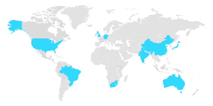
Tests were executed from 123 global monitoring agents, simulating end-user traffic across a diverse range of geographies.
This approach enabled us to capture both global averages and regional disparities in performance.
Each website was evaluated across eight critical performance metrics, normalized and weighted to reflect real-world impact.
Each website was scored using a weighted composite model that reflects both uptime and user experience.
Why? Because in today’s digital world, slow is the new down. A perfectly available site that takes too long to load still delivers a poor user experience. This balanced approach rewards both reliability and real-world performance.
The table below shows all evaluated banking websites ranked by their overall performance score(higher composite scores denote better performance). The composite score (0–100) encapsulates each site’s availability and performance, according to our weighted model.
Our benchmark reveals a clear hierarchy among the 19 SaaS platforms tested, shaped by how well each balances speed, reliability, and stability across eight critical web performance metrics. The most successful platforms aren’t just fast—they’re consistent across geographies and resilient under pressure.
Some companies stand apart by doing everything well—not just excelling in a single area, but balancing infrastructure, rendering, and stability. Four companies have achieved the coveted "Balanced Champions" status by demonstrating excellence across multiple performance dimensions without sacrificing any critical metric.
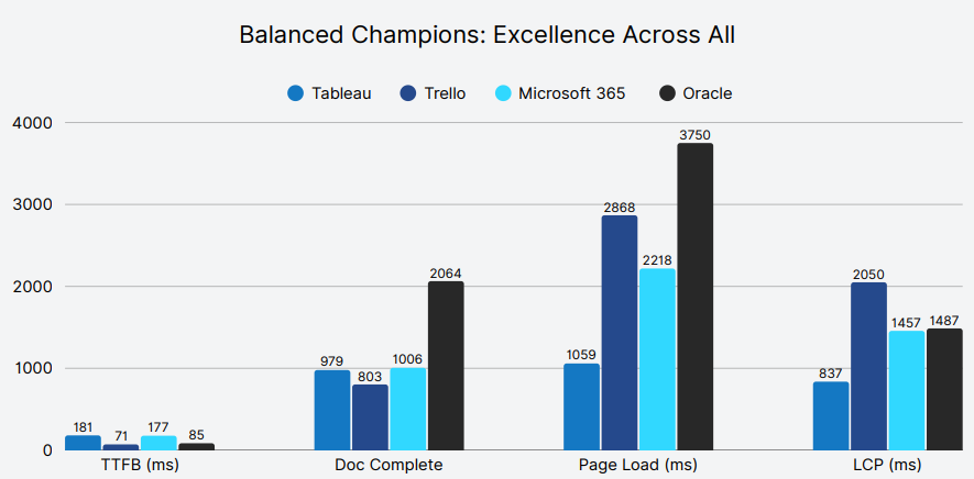
Takeaway: These balanced champions demonstrate that sustainable competitive advantage comes from avoiding the trap of single-metric optimization. Performance isn’t about being the fastest at one thing—it’s about not being slow anywhere.
While top performers balanced speed, stability, and responsiveness, others fell short by optimizing just one layer of the experience. Fast servers, perfect uptime, or clean layouts meant little when other fundamentals lagged. Here are the platforms most affected by these trade-offs—starting with ClickUp
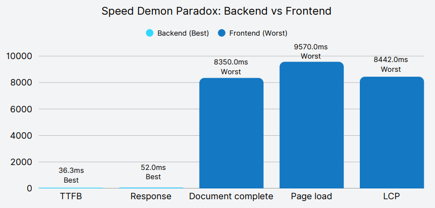
ClickUp (18th) leads on raw server metrics but falters on front-end metrics.
The bottom of the table told a very different story. First Data Corporation took nearly 1.8 seconds just to respond with the first byte and over 10 seconds to fully load the homepage.
Takeaway: ClickUp’s performance reveals a critical flaw in single-metric optimization strategies. Their servers respond faster than any competitor, yet users wait 8-9 seconds for usable pages, demonstrating that backend speed alone cannot deliver superior user experience. Organizations must balance backend efficiency with frontend delivery excellence to achieve meaningful performance outcomes.
Monday.com (19th) flips the script—rock-solid visual stability but glacial server response.
Root Cause: Exceptionally high wait times during the initial HTML response are the main driver of Monday.com’s sluggish server performance.
While DNS, Connect, and SSL steps are on par with competitors, wait time alone accounts for over 1.7seconds—compared to just 13 ms for ClickUp.
Takeaway: Perfect layout stability is commendable, but if users are left waiting for the page to start loading, the experience still suffers. Performance must begin at the first byte—not just at the visual finish line.
HubSpot boasts perfect availability yet stumbles on visual stability:
Root Cause: Infrastructure reliability overshadowing frontend health– Upkeep of servers and networks is excellent, but third-party scripts or CSS load patterns introduce layout shifts.
Takeaway: “Always up” is meaningless if your page jumps all over the screen. CLS must be treated as seriously as uptime in any holistic performance strategy.
True competitive advantage comes from balancing backend speed, frontend rendering, and visual stability—avoiding extremes in any single dimension.
Organizations should prioritize comprehensive performance optimization rather than focusing on individual metrics. The analysis reveals that balanced performance across all eight dimensions correlates with higher overall rankings. Companies like Tableau and Trello succeed by maintaining consistently high scores rather than achieving perfect performance in select areas while neglecting others.
For enterprise decision-makers evaluating SaaS platforms, these performance metrics directly impact user experience, productivity, and operational efficiency. The top-tier performers demonstrate that excellent web performance is achievable and should be considered a critical factor in platform selection.
Four companies—Asana, Hubspot, Trello, and Zoom—achieved perfect 100% availability. Once a headline-worthy feat, this level of uptime is now simply expected.
Yet, as the data shows, availability alone doesn’t guarantee a great user experience:
Takeaway: Uptime is no longer a differentiator—it’s the baseline. What separates leaders like Trello is their ability to maintain perfect availability while excelling in front-end speed, stability, and user experience.
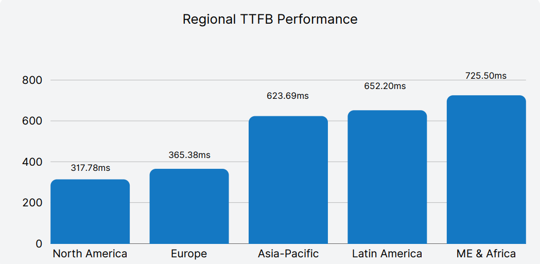
Users in North America and Europe enjoyed significantly faster experiences, with average TTFB around 313ms and 365ms respectively. Conversely, users in Middle East & Africa faced average TTFB of over 725ms, nearly 2.5 times slower. Latin America and parts of Asia also experienced notable slowdowns.
Performance struggles in emerging markets
A high-performing SaaS platform isn’t just fast in one market—it delivers reliably across geographies. To measure this, we calculated the Coefficient of Variation (CV) for each company’s web performance across regions. CV quantifies performance consistency, with lower values indicating steadier delivery across global users, and higher values revealing greater disparity.
The results expose a critical divide:
Takeaway: Global SaaS success isn’t just about peak speed—it’s about predictable, reliable delivery across all regions. Consistency builds user confidence, reduces friction, and scales trust worldwide. Platforms like ClickUp and Monday.com prove that even with performance challenges, regional uniformity can be a hidden strength—while SAP and Salesforce highlight the risks of uneven optimization.
Based on our analysis of 19 global SaaS websites, the following recommendations are designed to helpdigital, DevOps, and performance teams deliver faster, more reliable, and more consistent webexperiences for users across the globe.
Understanding performance isn't just about measuring page load or uptime. Catchpoint’s Internet Stack Map enables you to visualize the Internet dependencies impacting service or application performance at a glance.
The stack map below shows how various services—including DNS providers, CDNs, APIs, microservices, and third-party trackers—interact in real time to deliver a modern SaaS experience.
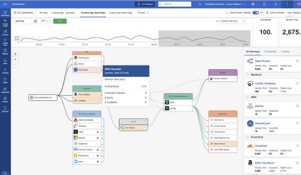
Powered by our industry leading Internet Performance Monitoring platform, you can correlate global Internet Sonar signals with your own application tests, giving you a unified view of availability, service time, and incidents across the Internet Stack
This level of visibility helps teams:
Explicit Congestion Notification (ECN) is a longstanding mechanism in place on the IP stack to allow the network help endpoints "foresee" congestion between them. The concept is straightforward… If a close-to-be-congested piece of network equipment, such as a middle router, could tell its destination, "Hey, I'm almost congested! Can you two guys slow down your data transmission? Otherwise, I’m worried I will start to lose packets...", then the two endpoints can react in time to avoid the packet loss, paying only the price of a minor slow down.

ECN bleaching occurs when a network device at any point between the source and the endpoint clears or “bleaches” the ECN flags. Since you must arrive at your content via a transit provider or peering, it’s important to know if bleaching is occurring and to remove any instances.
With Catchpoint’s Pietrasanta Traceroute, we can send probes with IP-ECN values different from zero to check hop by hop what the IP-ECN value of the probe was when it expired. We may be able to tell you, for instance, that a domain is capable of supporting ECN, but an ISP in between the client and server is bleaching the ECN signal.
ECN is an essential requirement for L4S since L4S uses an ECN mechanism to provide early warning of congestion at the bottleneck link by marking a Congestion Experienced (CE) codepoint in the IP header of packets. After receipt of the packets, the receiver echoes the congestion information to the sender via acknowledgement (ACK) packets of the transport protocol. The sender can use the congestion feedback provided by the ECN mechanism to reduce its sending rate and avoid delay at the detected bottleneck.
ECN and L4S need to be supported by the client and server but also by every device within the network path. It only takes one instance of bleaching to remove the benefit of ECN since if any network device between the source and endpoint clears the ECN bits, the sender and receiver won’t find out about the impending congestion. Our measurements examine how often ECN bleaching occurs and where in the network it happens.
ECN has been around for a while but with the increase in data and the requirement for high user experience particularly for streaming data, ECN is vital for L4S to succeed, and major investments are being made by large technology companies worldwide.
L4S aims at reducing packet loss - hence latency caused by retransmissions - and at providing as responsive a set of services as possible. In addition to that, we have seen significant momentum from major companies lately - which always helps to push a new protocol to be deployed.
If ECN bleaching is found, this means that any methodology built on top of ECN to detect congestion will not work.
Thus, you are not able to rely on the network to achieve what you want to achieve, i.e., avoid congestion before it occurs – since potential congestion is marked with Congestion Experienced (CE = 3) bit when detected, and bleaching would wipe out that information.
The causes behind ECN bleaching are multiple and hard to identify, from network equipment bugs to debatable traffic engineering choices and packet manipulations to human error.
For example, bleaching could occur from mistakes such as overwriting the whole ToS field when dealing with DSCP instead of changing only DSCP (remember that DSCP and ECN together compose the ToS field in the IP header).
Nowadays, network operators have a good number of tools to debug ECN bleaching from their end (such as those listed here) – including Catchpoint’s Pietrasanta Traceroute. The large-scale measurement campaign presented here is an example of a worldwide campaign to validate ECN readiness. Individual network operators can run similar measurement campaigns across networks that are important to them (for example, customer or peering networks).
The findings presented here are based on running tests using Catchpoint’s enhanced traceroute, Pietrasanta Traceroute, through the Catchpoint IPM portal to collect data from over 500 nodes located in more than 80 countries all over the world. By running traceroutes on Catchpoint’s global node network, we are able to determine which ISPs, countries and/or specific cities are having issues when passing ECN marked traffic. The results demonstrate the view of ECN bleaching globally from Catchpoint’s unique, partial perspective. To our knowledge, this is one of the first measurement campaigns of its kind.
Beyond the scope of this campaign, Pietrasanta Traceroute can also be used to determine if there is incipient congestion and/or any other kind of alteration and the level of support for more accurate ECN feedback, including if the destination transport layer (either TCP or QUIC) supports more accurate ECN feedback.


We get Catchpoint alerts within seconds when a site is down. And we can, within three minutes, identify exactly where the issue is coming from and inform our customers and work with them.”