Subscribe to our
weekly update
Sign up to receive our latest news via a mobile-friendly weekly email
Athletic brands are facing a troubling gap between what their dashboards report and what customers actually experience online. This risk is magnified heading into one of the busiest retail seasons of the year. This report analyses the top 20 athletic footwear and apparel brands by revenue, with performance measurements taken from over 120 locations around the globe and ranked using the Digital Experience Score, a holistic view of website and application performance from the users perspective.
Digital experience is no longer optional — it’s survival. Poor website performance doesn’t just kill online sales, it destroys in-store revenue too. Nike's digital platforms generate $12.1 billion of its $49.3 billion total revenue. Meanwhile, digitally influenced sales now represent 62% of all U.S. retail, rising to 70% by 2027. When your website fails, customers don't wait—they buy from competitors.
A single slow-loading page can hand customers directly to competitors who've mastered digital-first performance. The findings in this report challenge assumptions, expose blind spots, and reveal why only a handful of brands are truly delivering for customers.
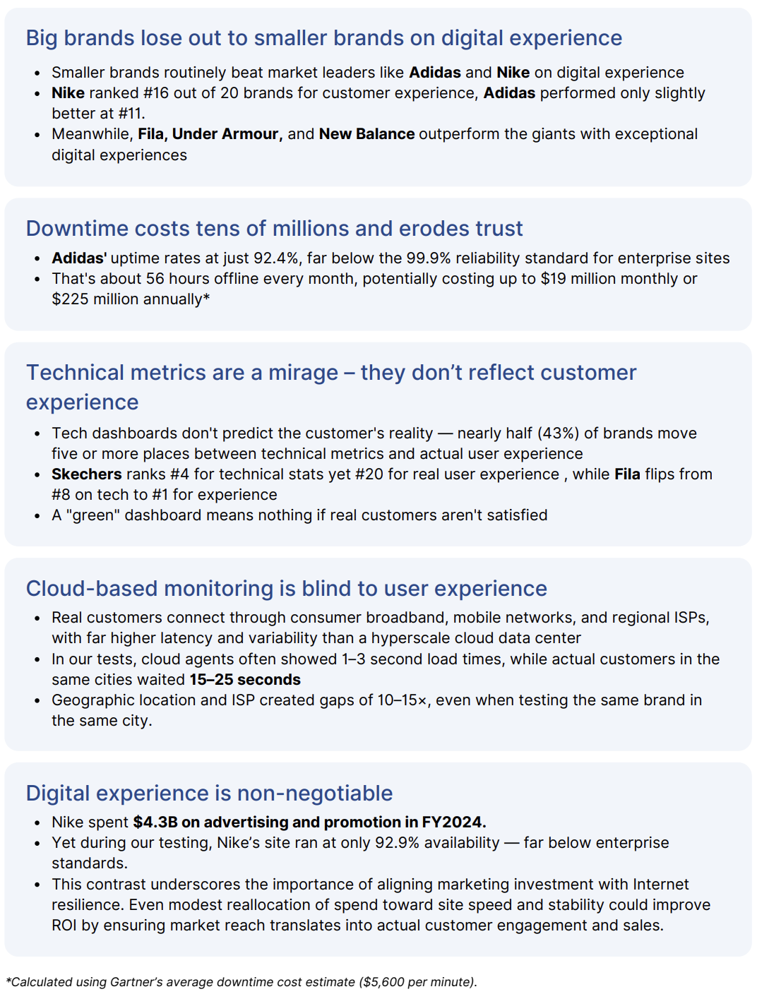
The table below shows all evaluated athletic brand websites ranked by their overall digital Experience Score.
The Digital Experience Score is a single, user-centric metric (0–100) that reflects how customers actually experience a brand’s digital touchpoints. Unlike raw infrastructure metrics, it combines device, network, and application factors into a holistic view of experience quality.
The score is built from three dimensions:
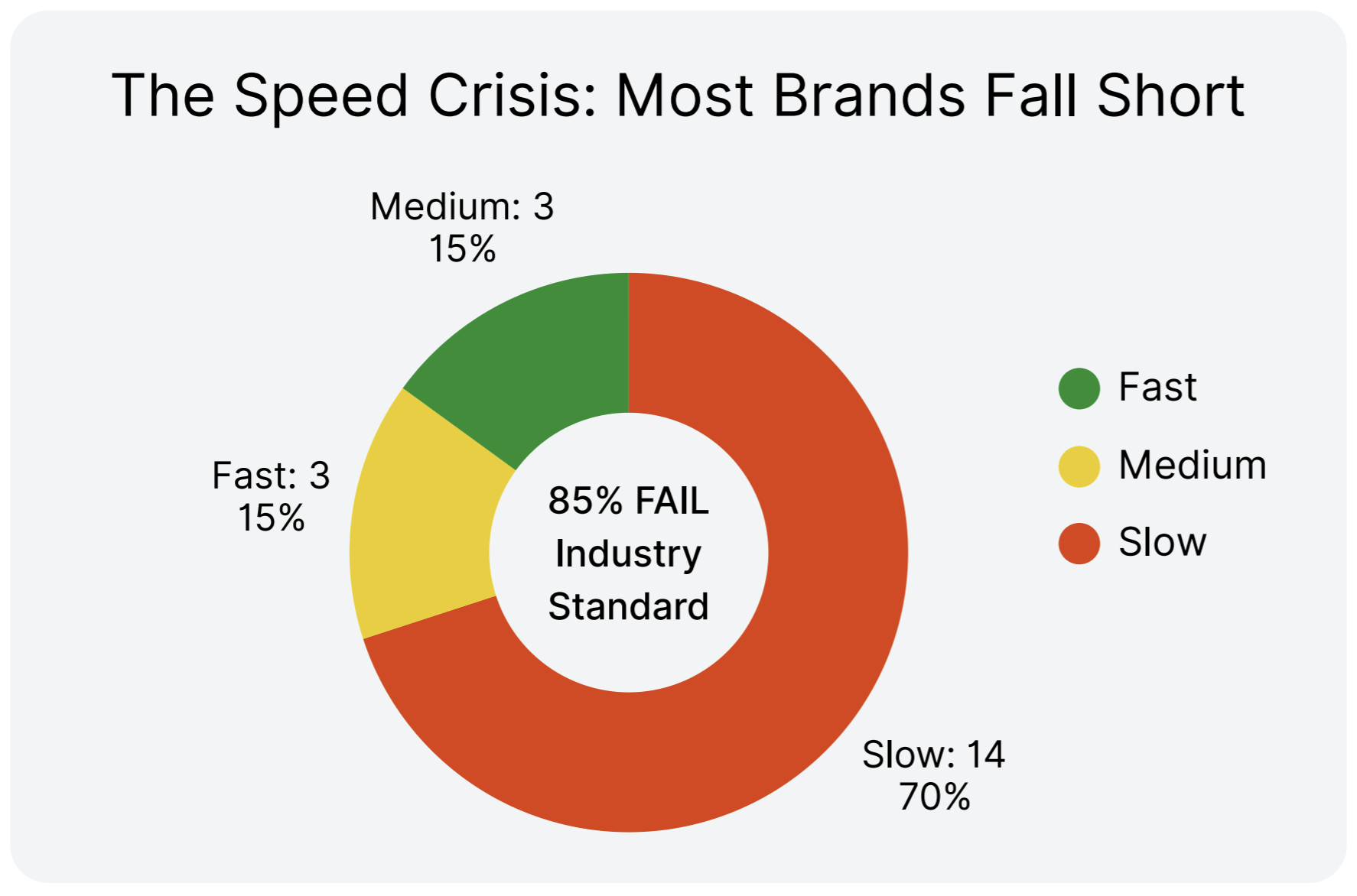
Most brands are underperforming, and revenue doesn’t guarantee performance.
Only 20% of the tested brands delivered exceptional digital experiences.
The industry's two largest players dramatically underperform:
So what?
Some might ask: if even the leaders score modestly, does this matter? The answer is yes because disruption doesn’t wait. Challenger brands like On and Hoka are already growing fast by capturing the revenue that giants leave behind:
When giants stumble, losses are amplified at global scale and create a strategic opening, one the disruptors are already exploiting.
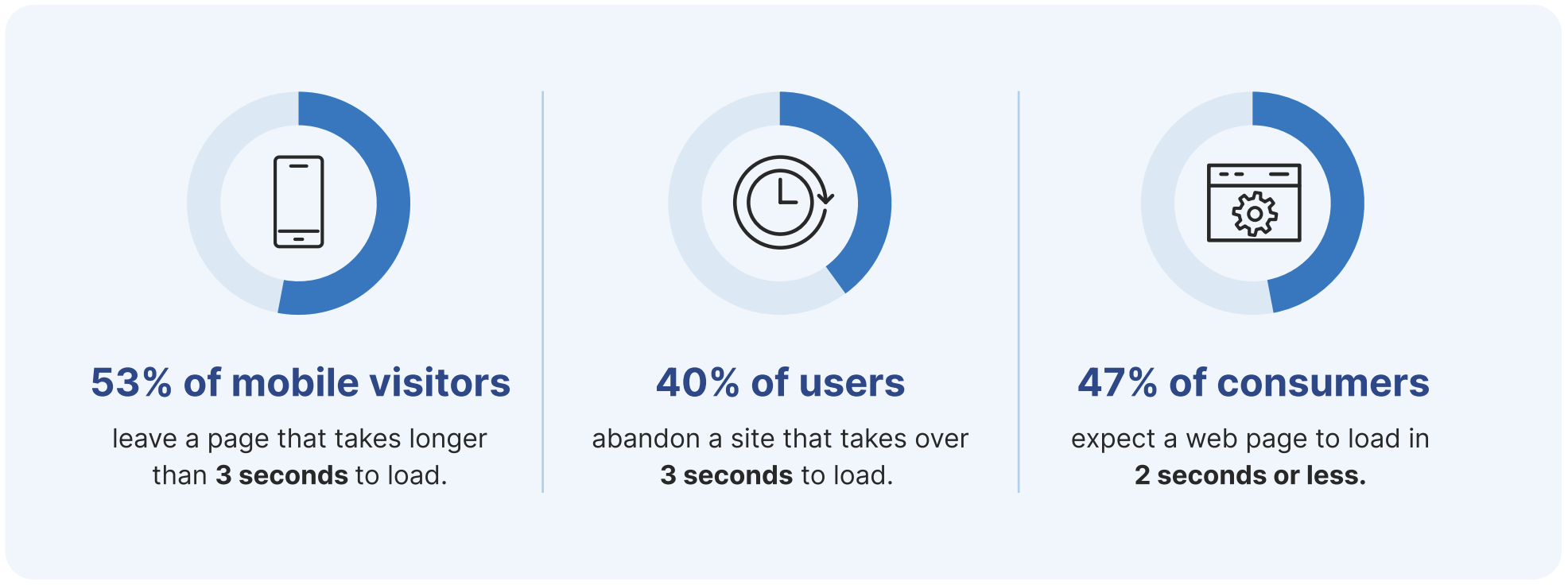
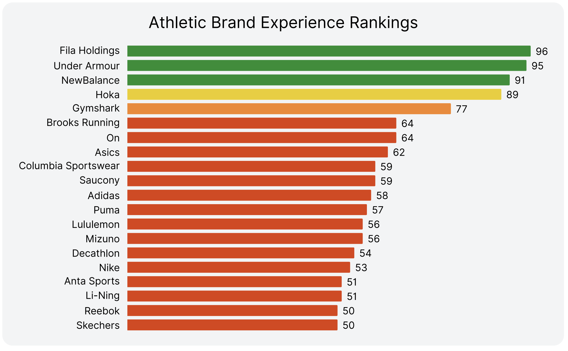
Most brands simply aren’t fast enough. Only a handful clear the 3-second industry threshold while the majority crawl well beyond customer tolerance.
The data makes it clear: faster sites consistently deliver better experiences, not by coincidence, but by cause and effect.
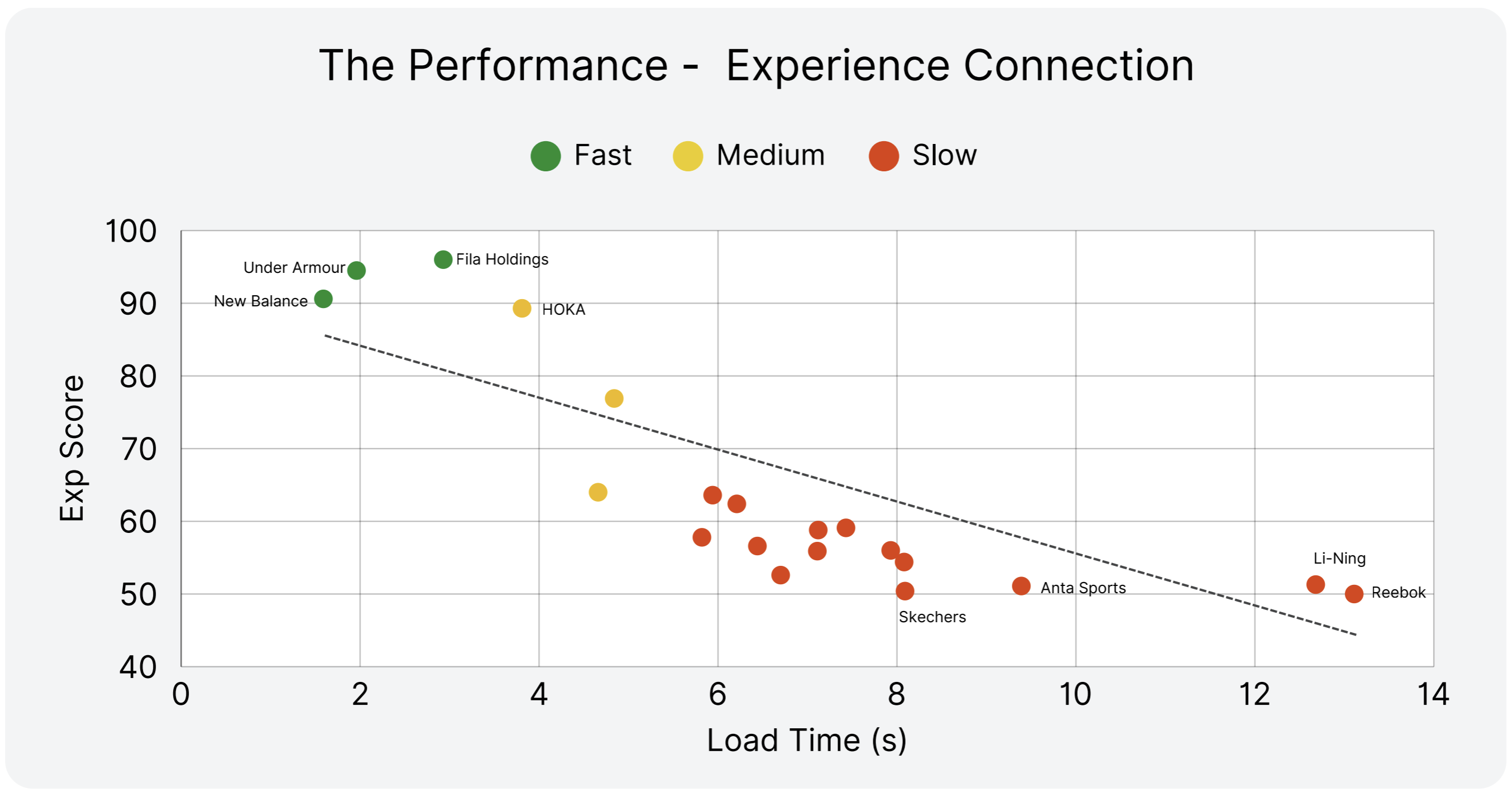
The faster the site, the higher the experience score
The top performers haven't just optimized their websites—they've recognized that in today's instant-gratification economy, slow is the new down. When customers can abandon a slow site and reach a competitor in seconds, speed becomes the ultimate competitive advantage.
Get a Free Retail Assessment with one of our Internet Performance Monitoring experts.
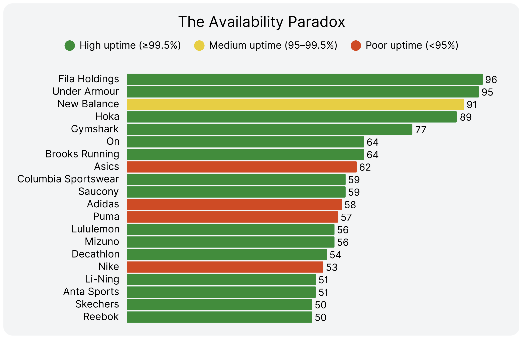
The biggest names, Nike, Adidas, Puma, and Asics, operate with sub-par reliability, well below enterprise standards.
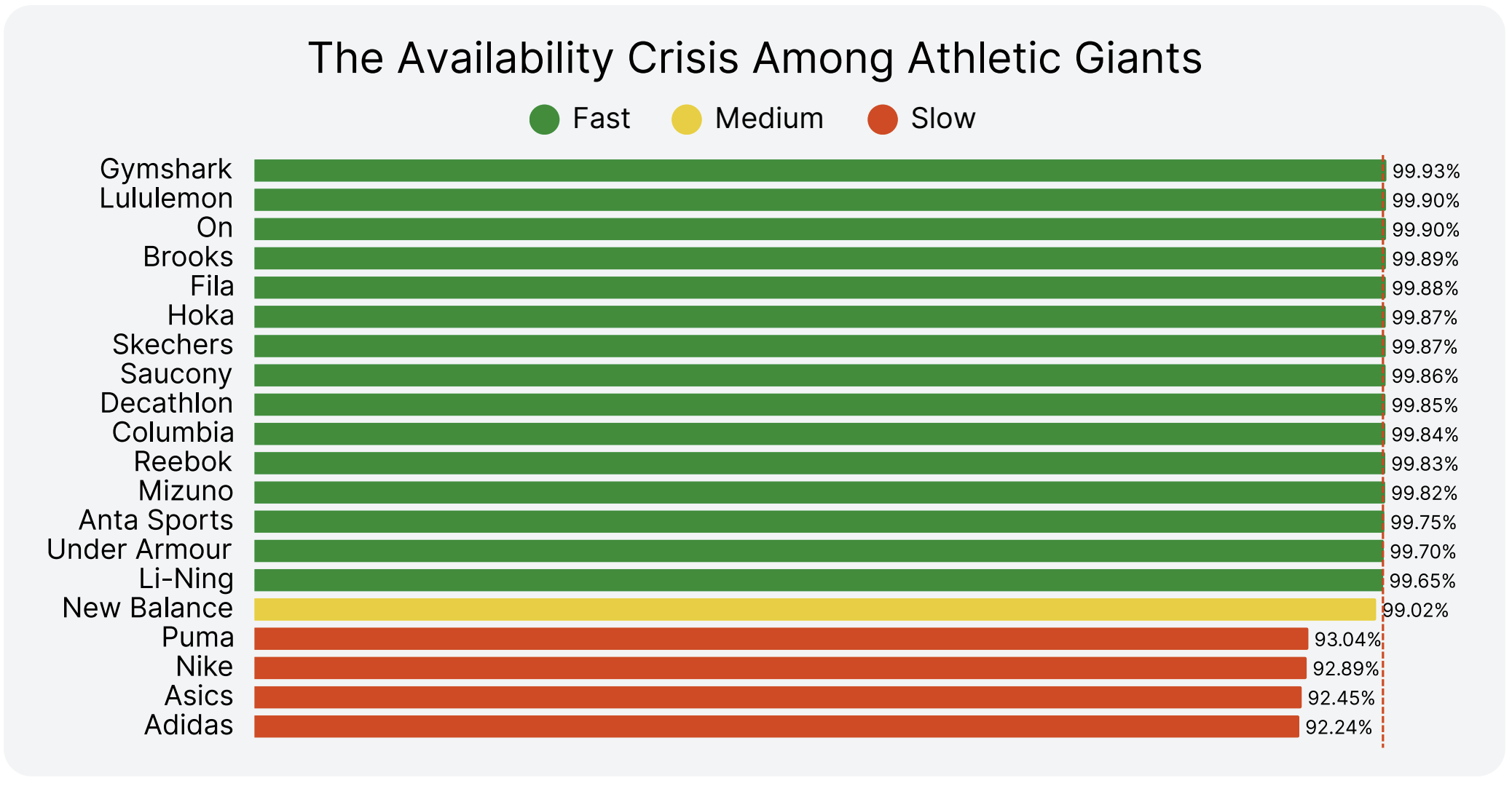
Challengers hit near-perfect uptime. Giants like Adidas and Nike lag dangerously behind.
When availability slips below enterprise standards, the financial impact is staggering. Nike and Adidas, the two biggest names in athletic retail, are losing hundreds of millions each year simply because their sites don’t stay online.
* Downtime costs calculated using Gartner’s $5,600/minute industry benchmark.
Perfect uptime doesn’t guarantee good experiences. Over half of high-uptime brands still fail customers.
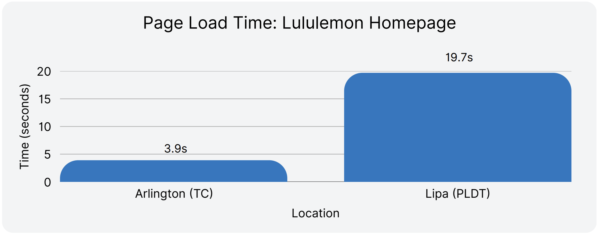
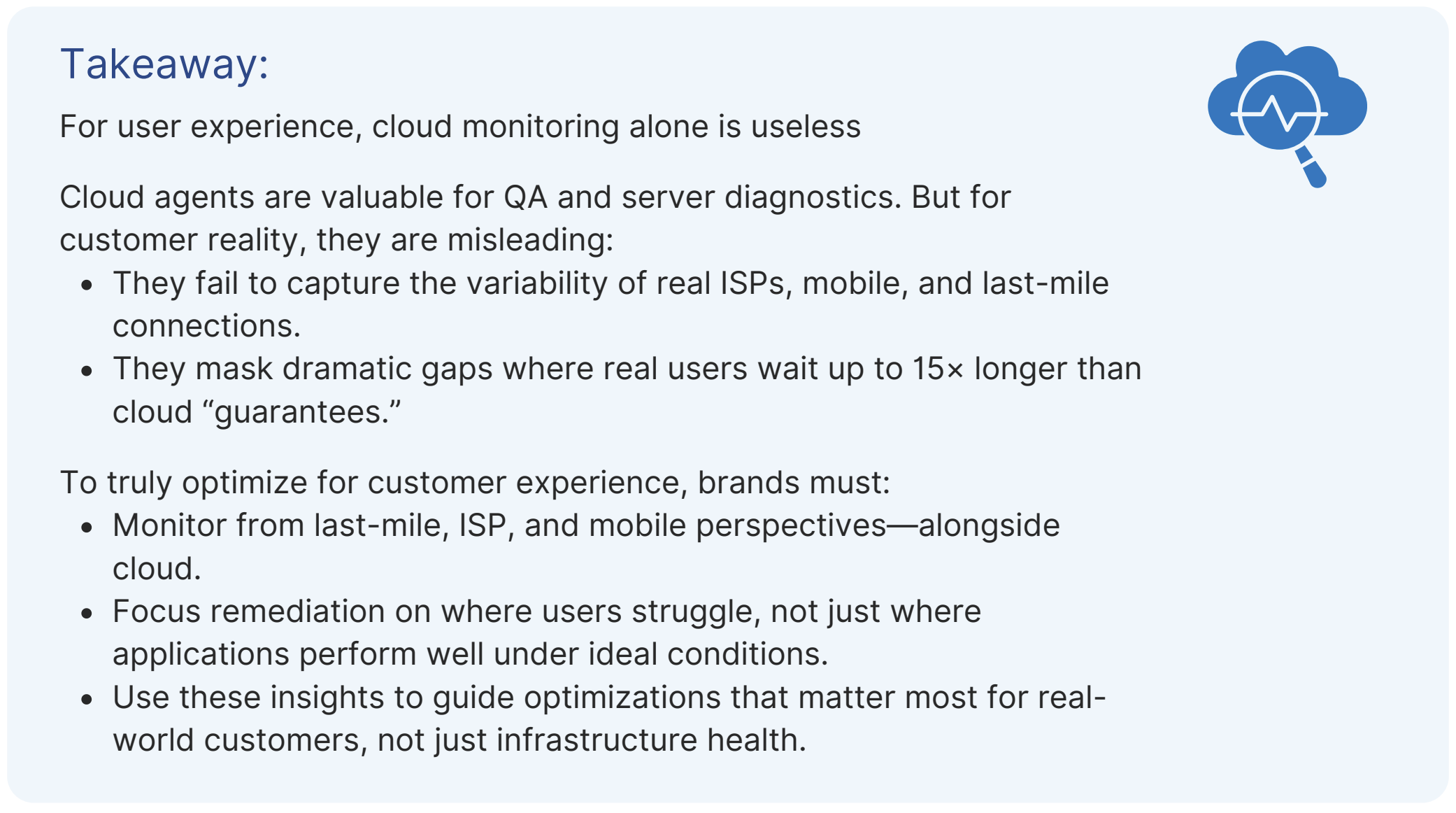
In the same city, for the same website, real customers waited up to 15× longer than cloud dashboards suggested.
Cloud dashboards don’t match customer reality. In our snapshot tests of Nike, Adidas, and Lululemon, the same websites showed radically different load times, sometimes 8–15× slower experiences, depending on where the performance was measured. Cloud agents running in controlled, data-center environments tended to showed fast results, while last-mile monitoring (simulating real users on consumer ISPs) exposed much slower, less reliable experiences.
This chart shows how monitoring vantage point alone can change the performance story.
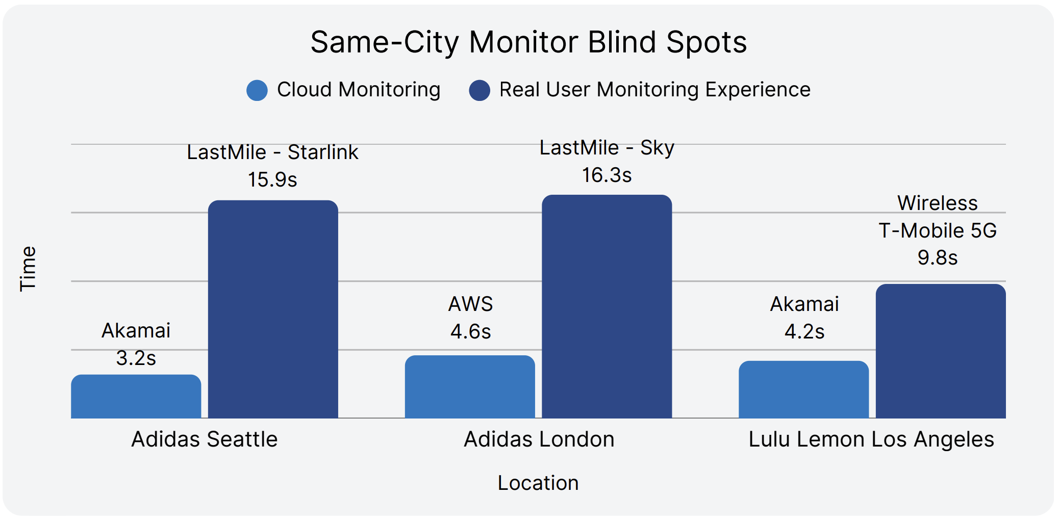
Why this matters: same-city comparisons remove geography. The only difference is how monitoring is done:
Perfect uptime doesn’t guarantee good experiences. Over half of high-uptime brands still fail customers.
Beyond city-level tests, the gaps widen globally. U.S.-based monitoring creates a false sense of security: what looks fine at home is unusable abroad. These aren’t edge cases; they appear in key expansion markets.
Even within one city, user experience can vary wildly based on ISP.
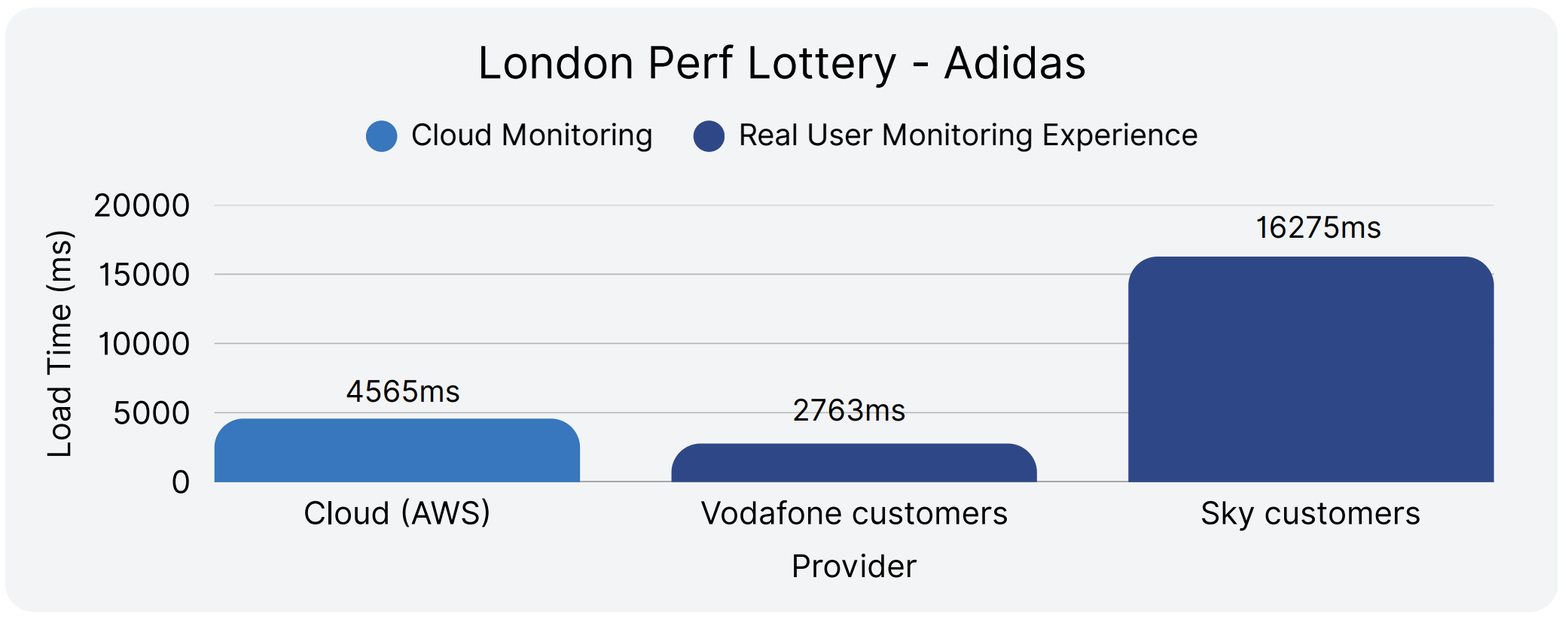
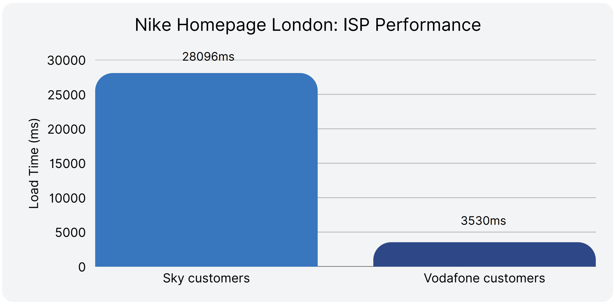
The blind spot: Cloud dashboards flatten these differences into a “steady” number, masking the 5–8× swings real customers feel.
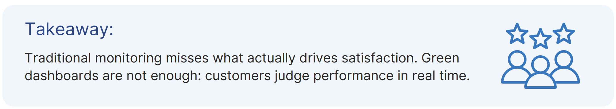
The most dangerous assumption in digital performance management? That green dashboards mean happy customers.
We ranked all 20 brands twice: once by customer experience, once by traditional technical metrics. The results expose a disconnect that explains why so many digital teams fail despite "perfect" infrastructure monitoring.
In addition to the Digital Experience Score, we evaluated each brand’s website across eight core technical metrics. These capture how a site performs from an infrastructure and browser perspective, and are commonly used in digital performance monitoring.
Metrics tested:
Ranking methodology:
This gap explains why digital teams struggle to improve business metrics despite green dashboards—they're optimizing for the wrong measures while customers suffer in silence.
Some brands shine in technical checklists but fall apart in real life.

Asics: the biggest comeback story
Fila: from middle pack to market leader
The alignment champions: strong on both fronts
Only two brands successfully convert technical strength into customer experience:
Both prove that well-designed systems can excel across multiple performance dimensions simultaneously.
Across performance, availability, technical metrics, and monitoring blind spots, one truth cuts through: what customers actually experience online is often far worse than dashboards suggest.
The lesson is clear: digital excellence doesn’t come from infrastructure metrics or perfect uptime alone. It comes from monitoring and optimizing the real customer journey, across devices, networks, and geographies.
In today’s fragmented and unforgiving market, digital experience is no longer optional. It is the ultimate competitive advantage.
This benchmark evaluated 20 of the world’s largest athletic footwear and apparel companies, compiled by global revenue rankings to ensure representation of the industry’s most influential brands.
Timeframe
All data was collected between August 1 and August 31, 2025, providing a consistent one-month snapshot of real-world performance across all monitored sites.
Monitored Pages
We tested the public homepages of each company — the first touchpoint for most shoppers. This provided a standardized basis for comparison, capturing how a typical visitor experiences each brand’s digital storefront.
Testing Locations
Tests were conducted from 123 global monitoring locations across six continents:
Agent types used
Catchpoint’s Global Agent Network includes cloud, wireless, last mile ISP, and backbone agents, each offering distinct vantage points to measure performance across region
Why variety matters
Using these varied agents delivers comprehensive visibility, ensuring both global averages and regional nuances in performance are accurately detected and differentiated.
Explicit Congestion Notification (ECN) is a longstanding mechanism in place on the IP stack to allow the network help endpoints "foresee" congestion between them. The concept is straightforward… If a close-to-be-congested piece of network equipment, such as a middle router, could tell its destination, "Hey, I'm almost congested! Can you two guys slow down your data transmission? Otherwise, I’m worried I will start to lose packets...", then the two endpoints can react in time to avoid the packet loss, paying only the price of a minor slow down.

ECN bleaching occurs when a network device at any point between the source and the endpoint clears or “bleaches” the ECN flags. Since you must arrive at your content via a transit provider or peering, it’s important to know if bleaching is occurring and to remove any instances.
With Catchpoint’s Pietrasanta Traceroute, we can send probes with IP-ECN values different from zero to check hop by hop what the IP-ECN value of the probe was when it expired. We may be able to tell you, for instance, that a domain is capable of supporting ECN, but an ISP in between the client and server is bleaching the ECN signal.
ECN is an essential requirement for L4S since L4S uses an ECN mechanism to provide early warning of congestion at the bottleneck link by marking a Congestion Experienced (CE) codepoint in the IP header of packets. After receipt of the packets, the receiver echoes the congestion information to the sender via acknowledgement (ACK) packets of the transport protocol. The sender can use the congestion feedback provided by the ECN mechanism to reduce its sending rate and avoid delay at the detected bottleneck.
ECN and L4S need to be supported by the client and server but also by every device within the network path. It only takes one instance of bleaching to remove the benefit of ECN since if any network device between the source and endpoint clears the ECN bits, the sender and receiver won’t find out about the impending congestion. Our measurements examine how often ECN bleaching occurs and where in the network it happens.
ECN has been around for a while but with the increase in data and the requirement for high user experience particularly for streaming data, ECN is vital for L4S to succeed, and major investments are being made by large technology companies worldwide.
L4S aims at reducing packet loss - hence latency caused by retransmissions - and at providing as responsive a set of services as possible. In addition to that, we have seen significant momentum from major companies lately - which always helps to push a new protocol to be deployed.
If ECN bleaching is found, this means that any methodology built on top of ECN to detect congestion will not work.
Thus, you are not able to rely on the network to achieve what you want to achieve, i.e., avoid congestion before it occurs – since potential congestion is marked with Congestion Experienced (CE = 3) bit when detected, and bleaching would wipe out that information.
The causes behind ECN bleaching are multiple and hard to identify, from network equipment bugs to debatable traffic engineering choices and packet manipulations to human error.
For example, bleaching could occur from mistakes such as overwriting the whole ToS field when dealing with DSCP instead of changing only DSCP (remember that DSCP and ECN together compose the ToS field in the IP header).
Nowadays, network operators have a good number of tools to debug ECN bleaching from their end (such as those listed here) – including Catchpoint’s Pietrasanta Traceroute. The large-scale measurement campaign presented here is an example of a worldwide campaign to validate ECN readiness. Individual network operators can run similar measurement campaigns across networks that are important to them (for example, customer or peering networks).
The findings presented here are based on running tests using Catchpoint’s enhanced traceroute, Pietrasanta Traceroute, through the Catchpoint IPM portal to collect data from over 500 nodes located in more than 80 countries all over the world. By running traceroutes on Catchpoint’s global node network, we are able to determine which ISPs, countries and/or specific cities are having issues when passing ECN marked traffic. The results demonstrate the view of ECN bleaching globally from Catchpoint’s unique, partial perspective. To our knowledge, this is one of the first measurement campaigns of its kind.
Beyond the scope of this campaign, Pietrasanta Traceroute can also be used to determine if there is incipient congestion and/or any other kind of alteration and the level of support for more accurate ECN feedback, including if the destination transport layer (either TCP or QUIC) supports more accurate ECN feedback.


We get Catchpoint alerts within seconds when a site is down. And we can, within three minutes, identify exactly where the issue is coming from and inform our customers and work with them.”